Monday 25 August 2014

Creative Blog hop!

Hello all!

This is going to be a quick one as I ran low on my time today but I was nominated to take part in the Creative Blog hop by my good (slightly weird) friend Lucy Gregg :).

The Creative Blog Hop happens every Monday and hops from crafter to crafter. 
We all answer the same questions and nominate 3 people to hop on to so here goes:

1 - What am I working on?
 
Lately I have been working on digital orders as besides a card crafter I am also a graphic designer. I currently have a few stencils to design and cut, some digi stamps to draw and some logos and business cards going!
 

2 - How does my work differ from others in my genre?

 Hmm... I guess its very inky. I like a lot of flow and while I love the neat look of some other card crafters, I just always seem to get a little messy. Controlled Chaos I guess?


3 - Why do I write/ create what I do?

I have always been creative. I have always struggles to find my perfect fit, in life and career. However, no matter which way I turn there is always some aspect of creativity there. I love creating something beautiful from ordinary things.


4 - How does my writing/ creative process work?

Google and Pinterest are my best friends. I usually start by picking up a product I have that I want to work with or an idea and then looking up what has been done in the past. Then I build up from there and make it my own. As for writing, I tend to just spit out whatever is in my head and try and make it make sense! ;)


Ok so nomination time... I don't know too many bloggers so I have chosen 3 members of my digi stamp design team to nominate!


Lauren makes the most wonderful crafty things. I have seen her create some gorgeous sewn stuffed toys as well as crochet (or knitting, not sure which but its awesome) and coloured cards! I know she is working on some new skills and when she masters them, crafters keep your eyes peeled because she is one to watch!


Katrina and I have been facebook friends for a while now. She makes some gorgeous layered cards and has her own business page selling them. I think my favourite thing about her cards is the way she manages to arrange flowers on them so perfectly!


Kelly joined my design team a little later but her work is fantastic. She does such a great job mixing colours, patterns and paper! She has done 2 gorgeous cards for me lately that I love!


Right, get to it ladies! I think your work is fantastic and everyone should see it! ;) Your turn for next Monday!

Wednesday 28 May 2014

Indigoblu tag (DT post Jb Crafting Supplies)

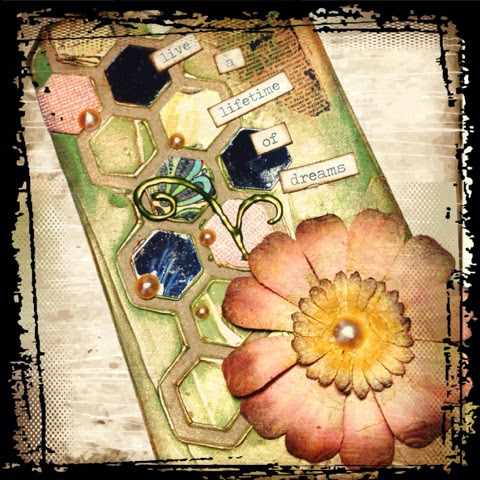
We are coming to the end of the month folks and let me just tell you, it couldn't have gone any slower for me! I wont go into detail but lets just say the process of this tag pretty much sums up my month.

As you know if you have been following, I received a lovely set of goodies from JB Crafting Supplies at the beginning of the month which included the fun stamp set from Indigo Blu called 'Take the time'. In it there was this eye stamp which I had seen on several different sets but always not a clue on how to use it.

This time, however, I came up with an idea right away to try and use it layered with several fades of black. Ive only ever done this with leaves so it was a really new thing for me. I had the idea that I would stamp on my tag multiple times without re-inking every time. The plan was to stamp the eye again on a piece of vellum and layer it on top.

So that's how this tag started out. I stamped my eyes, (<-lol) and surprisingly the layout turned out well. The I took a few colours of distress inks and inked around the tag. Unfortunately once I had blended them on they lost a bit of their vibrancy and the tag wasn't quite as bright as I would have liked it to be. Anyway, I left it as is and continued with the tag. I tried to bring a bit of colour back into it with a couple of drops of dylusions and then also spattered it with some picket fence distress paint.

Once I had (supposedly) finished the base tag, I cut a tag from a piece of vellum and started working on that. I stamped my eye stamp onto the front and inked the vellum to try and bring a bit more colour to the tag. The stamp was not popping out as much as I wanted so I painted the back of it with white.  I then tried to adhere the vellum tag to the front of my base tag as it wasn't showing as much of the background so I wanted it pressed right up against the base. In the end I was very unhappy with the finished result so I pulled off the vellum tag and scraped that.

Now to try and salvage the base tag! A few parts of the tag had been pulled off when I removed the vellum piece so I just covered those over again with a bit of distress ink and it was completely gone.  The eyes were blending too much into each other so I chose to use a bit of white gel pen to fill in a few of them. I filled in the whites of the eyes on some and then just the reflection on others.

By this point I was beginning to be a little happier with how it was going. However, it was not to last.

Let me give you crafters a small piece of advice.... NEVER PUT ANYTHING DOWN!......EVER.

Im sure some of you have experienced this before, especially if your craft desk looks anything like mine but I have had several things go missing this month! And the very annoying this is, it goes missing right after Ive just had it in my hand! I put it down and *POOF* its gone! So remember when I said I have been working on this since the beginning of the month? Well its because I had misplaced my white embossing powder. I had a plan, and then the white embossing powder was gone.

So I tried to improvise. I tried using a coloured embossing powder. I thought maybe a reddish orange would go with this. Well I was wrong. In the process I also didn't stamp correctly. So I had a very not pretty slightly hidden in the background, orange sentiment. Go me. :/ Well I tried to fix it with my white gel pen. I outlined the sentiment. Another big mistake! So now I had royally screwed up my tag. It looked horrible. By this point I had had enough and set it aside until this past weekend when lo and behold, I FOUND MY WHITE EMBOSSING POWDER!

Now I have the task of figuring out how Im going to salvage this tag! So I thought I would try and remove some of the embossing powder. I used my heat tool and a sheet of paper to try and melt off what was there. This really didn't work and mostly smeared the white gel pen. then I thought I would try and blend some black onto the tag in that area and emboss over it with the white. However, as I should have known, the embossing and the white gel resisted and it looked horrible. So I tried using some archival ink over the area and then blending with the black distress ink... Nope. The embossing took the archival ink but it just made the sentiment look shiny. Until I used the distress ink, then it just wiped it off.

After all of this I gave in and decided to use the traditional method of covering a mistake... Just cut a a bit of card, inked it up with black soot distress ink (I pressed it directly into the pad which left white bits and then I blended some over it to give it the grungy look) and white embossed the sentiment onto that. I mounted that onto a slightly larger piece of white card, and stuck this on top of the damaged area of the tag. To tie it into the rest of the tag even more, I splattered a bit more white distress paint over it and inked the edges of the tag with black soot distress ink.

My tag is finally done! Just like this month. Honestly I actually like the end result. Lesson to be learned here|: Don't always give up in the first round! The possibility to get better only ends when you give up.

Hope very much that your month was a good one and fingers crossed for me that next month is even better!


Sam.

Tuesday 27 May 2014

Take the time tag! (DT post) JB Crafting supplies

Hi my crafty friends!

This post is a little delayed on my page and you may have seen it before if you follow me at all over at JB Crafting Supplies. I am very proud of this tag though so I just wanted to share with my followers who haven't seen it. And if you want to be first to know of some of these weekly posts, head over to JB Crafting Supplies Blog and check back every week!

{And just a quick little note before getting started, I apologize for the disclaimer on the bottom of my pictures. I am trying out a watermarking app for my phone and have yet to decide it I want to purchase it or not!}

For this tag I decided to go with some warmer colours. I used mustard  seed, barn door, wild honey and vintage photo. I inked the tag starting with the lightest colour and then surrounded it with the darker ones. I stamped the background with some script stamps and postal stamps very lightly with Walnut stain and then threw a few droplets of gold shimmer water onto the tag which I then blotted off. I have a small obsession with tim holtz products so again I used one of his dies to cut my hexagon strip out of the same beautiful graphic 45 paper from last week. I did not do any inking on this, though in hindsight I might have brought some darkness around the edges.

 
I chose several stamps from the Indigo Blu stamp set 'Take the Time'. I have a small obsession with keys, locks and of course CLOCKS and watches, and I loved the sentiment that came with this set.
First I chose the cogs, the sentiment, the advertisement and the watch and laid them onto my tag to get an idea of placement. I always try to do this if I can as it gives me a starting point to go by. I decided that I wanted to use the watch as a focal point so I stamped that onto some white card twice for colouring and layering. I blended in the same colours from the tag into the centre of the watch, adhered it to the other stamped image with some thin foam adhesive which I then covered with rock candy crackle paint. You can use any crackle medium for this and I probably should have used crackle accents myself as the crackle on this meant that I lost a lot of the detail in the watch.

I stamped the advertisement stamp directly onto the tag with embossing ink and then blended over top of it with gold pan pastel. I also used the embossing ink and gold to line the edges of the tag.

 I stamped my cogs directly onto the tag  as well and then stuck my die cut and watch on top. I added a small ball chain to look like the watch was attached to it. This I glued with glossy accents for extra strong hold. I used glossy accents one more time to stick down a cogs charm behind the watch to add some more interest to the tag.

I wanted the sentiment to show up but I also didn't want to cover all the beautiful background work on the tag. So I stamped and embossed with black embossing powder onto heat resistant acetate. I stuck small bits of foam adhesive to the back hidden behind the letters and stuck this to my tag. I finished the whole thing off with a bit of cream lace.

I hope you like the finished result. I wish I had played around with placement a little more but over all I am happy with it.

Happy Crafting to you!

Sam.


Saturday 17 May 2014

Galaxy background and digi offer! (video tut)

Hello All!
 
Its a lovely warm day today and Im sitting here inside creating just for you! I was playing around a couple of evenings ago trying to find my mojo, and completely by accident I created this awesome background! Im always really happy to find a new technique and I just have to say its even better when I manage to come up with it myself. My mojo must have been lonely on its own because it certainly reappeared just at the right moment! 


I spent several hours creating a video tutorial for you and just as I was about to edit (around midnight) the video vanished! So I spent another several hours yesterday refilming and editing this! Lo and behold, once I have done it all again, the original file resurfaces. Isnt that just my luck!
 
So have a watch of the video below if you want to find out how to do this background! 


As a little bonus for all of you who have visited my blog, I have a special digi set that I have created called To The Moon that you can use with this background!
 
To The Moon - full set - £4
 
If you would like to purchase this set, please send me a request to Samantha@autumnmoondesigns.co.uk and quote GALAXY25 to receive £1 off!
 
ALSO, if you share with 2 or more friends who purchase, you can get this set for free! Just make sure they give me your name and email at the time of purchase.


If you like this video, and/or digi, I would appreciate any feedback so that I know whether to continue making them and creating my digis! Also I love reading comments!
 
See you all again soon :)
 
Sam.


Thursday 15 May 2014

Quick tips - DIY pearlescent water spray

Start with an empty spray bottle. Here I am using a 100mL spray bottle which I bought at Boots. You also need perfect pearls in your chosen colour (Im using Perfect Pearl), a scoop, and some water.
Scoop out a small amount of the perfect pearl powder. I used 3 small scoops because Im using a larger bottle and you can top it up as well. However, you really don't need a lot at all. I only used one scoop for my 50mL bottle and that lasted me several refills.
Add the water. I am only using plain water but if you want to make different colours of spray you can also use food colouring, dylusions, distress reinkers etc.


Replace the lid and shake the bottle. Voila! Pearlescent water spray. Be sure to shake this before each use as the powder will settle at the bottom of the bottle. So far I have no problems with clogging but I expect that if you use too much powder you may have some issues. If this happens run the nozzle under running water and spray clean water through it a couple of times until it works again. If this doesn't work then get a new bottle and don't put so much in! lol.

Here I have used Perfect gold in a 50mL bottle. I only used half a scoop for this one but that's all that was needed. Please make sure you are using the perfect pearls powder that is very smooth. I have done this with a friend using hers and they were not the same consistency and definitely did clog up the spray bottle. The name of them escapes me at the moment but when I find out I will definitely update this post.
 

Click here to return to the QUICK TIPS page.

Midway Flower Power! - A little bit crafty Dt

Earlier in the month I coloured in a lovely hummingbird image for the flower power challenge over at A little bit crafty. I used my distress pens and watercoloured it which I have really taken to lately. I love the soft look of watercolours and the detail with lack of detail if you know what I mean.

 Since we are still in the flower power month over at A little Bit Crafty, here is another for you!

I was playing around with a gorgeous floral background stamp I have in my collection of beautiful wooden stamps that I rarely use. I really wanted the design to be the main focus in this card but always had a hard time using it as it was a bit busy. Browsing on pinterest and youtube really helps the inspiration though. I know Im not the only one!

So I stamped with embossing ink and clear embossed on watercolour paper, then used my distress pens to colour in the image. I was very messy colouring in and didn't really stay inside the lines. Its also not necessary to colour all the way to the line either. Once I had finished colouring it, I spritzed the whole thing with pearlescent water and just let it sit to dry. Spray generously to get all the colours to blend together. However if some of the colours start to mix and look a bit muddy, just take a bit of paper towel and very lightly just lift some of the puddles. Since this is distress ink you can also rewet it once it has dried which I did as I thought I needed to add a bit more blue because some of the other colours had mixed with it and it wasn't quite as clear as I wanted it to be. The beauty of distress inks!

This was a really quick process from start to finish so I had a bit of fun making a collection of cards using the same technique. It sure does bulk up my finished card stash! Now I just need to start passing them out!

I hope you give this a try as it really is very easy. And again, don't forget to head over to A little Bit Crafty for the challenge as there is still time left!

Thanks for stopping by!
 
Sam


Wednesday 14 May 2014

Another Flower power tag (and video tut!)

Hi Guys! Here again partway through the month to share another creation for A little Bit Crafty Challenge blog. If you haven't yet checked it out, this months challenge is Flower Power, and there is still time left to enter!
 
I recently made this watercoloured tag and posted it on Facebook. I've had a few requests on how to do it and I thought I would do something a little different and make a video!


Please bear with me on this video as its only my second one and editing is still very new to me! If you like it please let me know and I will hopefully make more and improve on my skills!


I hope you enjoyed the video and please do let me know if you want me to make more.
 
Here is the tags side by side again:
 
 
Have a crafty day!! And don't forget to enter the challenge!
 
Sam.
 

Using patterned papers (DT post)

Hey there again!
 
We are into our second week for the month of lovely crafting with supplies provided by the lovely Julie at JB Crafting Supplies.
 
For this card I decided to just go crazy with the beautiful papers provided (Graphic 45) and the sentiment from the lovely Indigoblu 'Take the time' set. I did some layering and inking and ripping and embossing and got this beautiful result!
 
Supplies Used:
 
Graphic45 - 12x12 Olde Curiosity Shoppe Collection
Tim Holtz Weathered Clock
IndigoBlu - Take the Time stamp set
TH Distress ink - Vintage Photo
Uni-ball Signo Broad white gel pen
Archival Ink - Jet Black
X-Cut embossing folder - Chronology Clocks
brass brad
We R Memory Keepers hole punch


I started with this beautiful graphic45 paper which was cut down into quarters. I die cut a clock with one sheet and embossed the other with my clocks embossing folder. Since the paper was larger than my embossing folder, I had to run this through twice. I wanted to ink over the embossed sheet to bring out some of the details of the embossing but because the design on the folder didn't quite line up when embossed twice, I had to be careful not to ink too much. Before I did this I tore around the paper so as not to have any crisp cut lines and then I inked vintage photo around the edges. I stayed mainly on the outside of the paper but I did bring in the ink slightly just to bring out the texture of the paper. I adhered this to my card.
 
I then took my die cut clock and inked around the edges there to make sure that stood out a bit against the business of the background. I mounted the clock with a full die cut piece of foam adhesive just so that it would lay flat and not curl up in areas. I recommend die cutting the piece already attached to the foam as it wasn't easy lining it up afterwards!
 
With the clock hands, some people arrange them at a significant time or some at the usual 12, 9, or 6 etc... I decided to line mine up visually and just filled the space after placing my sentiment.
 
The sentiment was stamped with the IndigoBlu stamp in archival ink onto white card. I did a mixture of inking and soaking of the paper to give it some age. Unfortunately this made me lose a lot in the sentiment visually so, after I dried the paper with my heat tool, I decided to take my white gel pen and fill in the main words to pop it out a bit.  I inked around the edges a bit more and stuck it down to my card.
 
Lastly I added a few metal embellishments to the top corners and my card is done! Personally to me it has the feel of wood chip art. I am not one for using patterned papers but these are beautiful and Im very pleased with the final result. I hope you are as well!


Tagging again! DT post for JB crafting supplies


Its May! What a lovely time of year. Its when all the flowers are supposed to come out! Last week I was particularly excited to receive my lovely dt pack! It took me all of 2 seconds to get some ideas in my head of what I wanted to do. Of course, as usual, nothing went the way I planned it but I still love how this weeks make came out!
 
I started off with my tim holtz tag die which I covered with some modelling paste that I had coloured up using some gold and green paint. I received some lovely patterned papers from Julie and I knew that I wanted to use them with this fun frameworks die by tim holtz. Among the papers was some graphic 45, some core-denations cardstock and some kraft card that was lined like notebook paper. I cut these several times along with some mirror board by tim, so as to have a mix of hexagons to work with. Before the modelling paste had dried I pressed a few of these paper shapes into it and pushed down slightly to get a bit more texture.

 
I put my tag to the side and while the modelling paste was drying, I took some liquid pearls in corresponding colours and created a few different size pearls and shapes on my non stick craft sheet.

 
Then I took some plain paper flowers that I had and coloured them with matching ink and gold paint watered down with gold shimmer spray.

 
I left my tag, my flowers and my embellishments overnight to dry before moving on. I rarely do this as I get too excited about wanting to see the finished product but when you are working with so many things that can easily be smudged or altered with inky fingers or pressure, its best to leave them to dry as long as you can. A heat gun works at times, like for example my flower, but using the heatgun on modelling paste can cause it to bubble and that was not my desired effect for this tag. On occasion I do use the heat gun and purposefully cause the bubbling for texture. This also works with paint. However today I was sensible and left it alone!
 
Once my tag had dried along with all the extra bits I created, I moved on using some lovely pan pastels I had been provided with. I used a mixture of light gold and bronze which I sponged over the entire tag. This really gave the bumps and ridges of the modelling paste some emphasis. Sadly, it was not easy to capture by camera but it was gorgeous! I think I sat staring at it for a little while afterwards!

 
To finished it off, I added a bit more mirrored tiles, a rub on (which tbh I could have done without) and I created my own sentiment using Tim Holtz chit chat stickers which I edged with distress ink. I also added the flower which I had inked up the night before and my liquid pearl embellishments.

 
To finish the tag off I threaded a bit of ivory lace through the hole at the top. When I first did this, I pulled the lace a bit too tight and ripped it right out of the tag! As frustrating as it was, I wasn't prepared to redo the tag so for a quick fix I stuck some thick cardstock to the back of the tag along with the tiny bit of tag that got pulled off. I then punched a hole where it was previously and CAREFULLY rethreaded!
 
 
I hope you give modelling paste with pan pastels a try as I think it was my favourite thing about this tag! Don't forget to stop by JB Crafting supplies and have a gander at my make next week as well!
 
See you all then, and happy crafting!
 
Sam.

Thursday 1 May 2014

Flower Power! Dt post for A little bit crafty

This month my head has been all over the place in one of those hectic, I-don't-know-what-im-doing, anxious moments. My crafty mojo did a runner and has only recently come back (thank goodness!)

I am running extremely late as usual getting myself together for all the commitments I have made but here I am, following through! I know a lot of you can relate, especially when you have 3 little munchkins who have unfortunately been off sick from school after a 2 week holiday. Very stressful.

Flowers are one of my favourite things. They are all so different and I love almost every one. One of my favourite scents is rose as well so flowers everywhere for me! So this months challenge for A little Bit Crafty was definitely up my alley!

I know its expected that I load up a card with 3d handmade flowers and I would LOVE to be able to do that. But I am so picky when it comes to flower arrangement that I am still working on my skills there. It needs to look random whilst not actually being random. Not an easy task! So this month I am actually using a digi stamp from our sponsor Bugaboo Digi Stamps.

When I went to print out my image, I discovered that I had actually run out of my white card. So I decided to have a play around and print it directly only my pearlescent square card. Unfortunately for me my printer wasn't playing nice and did not want to take the thickness of that particular card. So I had to do a little rethink and print onto a thinner 5x7 inch card instead. Of course I really had to think this through as 1. there isn't a setting for these measurements on my printer and 2. the card was rectangular. The image was square. So placement is important to make it work. Of course I could have printed it and then just cut it down but what fun is that? So I went into my graphics program (photoshop) and created a layout with the image, a sentiment and a divider. It was simple yet effective. Since birthday cards are always in high demand, I made this one just that.

Once I finally got over all the printing hurdles, I left it to dry for a little while and broke out my distress pens in my selected colours. For the most part I used my waterbrush and some pearlescent water to do the main part of the painting. For the sky I used a wider flat brush so as not to get too many streaks. I wont go into the details of the actual painting as it was quite a simple thing but if for any reason you want me to add them please feel free to leave me a comment saying so.  Just remember as this paper was not watercolour paper be a bit lighter with the water and the blending than you normally would have.

Once I had added the colour to my image, I just heat dried with my heat tool to speed things up a bit and then, while it was still warm I laid a heavy object on top (in my case a Bigz die) to flatten it a little as all the water and the heat had warped it a bit. This wont flatten it completely but if the warping bothers you, you can always take an iron to it. (without steam of course!) Please be sensible though when ironing paper!


I had found this lovely decorative frame in poundland of all places and it was perfect to display some of my smaller bits of art. So I stuck my card in the frame just for photographing purposes. Loving it!


Happy Crafting! And don't forget to head on over to A little bit crafty for your crafty challenge and to the sponsors page as well!
 
 
Sam.


Wednesday 30 April 2014

Guest Blog post over at Chocolate Baroque!!


A while back I answered a Design Team call for Chocolate Baroque. Although I did not get it, I was asked to create something using their stamps for a guest post. I was so excited!

At the time, though I had been a constant admirer of their lovely designs, I had yet to make any purchases. So I felt that this was a definite good time to finally add some Chocolate Baroque to my growing stamp collection, and I was not disappointed! Here are a few pictures of my final product, but I hope you will head over to their blog here to see my post which has come out today!


Thanks for checking it out and don't forget to head over to their page with the link below to have a look and some of their amazing goodies!
 
Sam
 
 
http://www.chocolatebaroque.com/

Friday 4 April 2014

Xbox controller card

So today my eldest daughter has been invited to a birthday party. Now, I have a stack of cards piled up in a box from when my crafty mojo gets going but unfortunately, I rarely have inspiration to make a mans card or a little boys for that matter. Luckily this time around I had called his mum and asked her what he liked so I could buy an appropriate present for him. In the end money is tight this month so we have had to cut back in certain areas of our spending so I felt I really needed to go all out on this little mans card, and seeing as he liked Xbox so much, why not a controller?

I know you have probably seen these types of cards all over the place but I really wanted to give it a little more than just 'cut out circles. stick down. done.'. So for this card I used the following:

  • Dylusions sprays from Ranger
    • Lemon zest
    • London Blue
    • Postbox Red
    • Fresh Lime
  • Distress Inks and markers
    • Black Soot
    • Pumice stone
    • Crushed Olive
    • Mustard Seed
  • Water brush
  • White gel pen -my favourite is Uniball signo Broad white gel pen
  • Black cardstock for the base
  • white cardstock for the buttons
  • Glossy accents
  • white embossing powder - stampendous white
  • Heat gun
  • foam adhesive

First off, I did a search for an Xbox controller template and found the perfect one from here. On the plus side, if you have a cutting machine, it also has a cut file as well as a digi stamp! Lucky us huh? I wanted a card around a 5x7 size so I printed my controller on regular copy paper to use for my template. I do have a cutting machine but sadly its been a while since I properly tidied my craft area and they need to be dug out before I can use them. So I did it the old fashioned way and traced and cut around all of the pieces, however if you have a cutting machine, feel free to use it here!
I folded my black card in half (a scoreboard comes in handy here if you have one) laid my template against the score line with the card folded in half and marked the bottom of the controller. I used my ruler to draw a straight line across so that when I lined up my template, it would be even and sit properly on a table. I stuck it down temporarily and cut around it to finish off the base of my card.

Instead of cutting out all the circles and tracing them onto my white cardstock I printed the whole thing out again and just cut them directly from the card.

Once I had all of my pieces ready, I pulled up a picture of an Xbox controller on Google and went to work copying the buttons. I knew I wanted my colours to be bright because if you have ever seen one of these controllers, the buttons glow. I really wanted to retain that quality when I coloured them so I started by spraying each of the letter buttons with my dylusions sprays. I let these soak in a little before hitting them with the heat gun to speed up drying time. To draw the letters I used my white gel pen which I knew would mix with the ink and lighten it up in areas. To darken other areas I used mustard seed for yellow, and crushed olive for green. The red and blue were dark enough so I just 'pulled' the colour out of them in areas with water. To do this you just paint plain water on where you want it and dab it off with a towel. I used this technique on the logo button as well.

For the grey buttons I did the same basic concept, except that I used a blending tool with pumice stone, white gel pen for the highlights and pumice stone marker and a dry water brush (this gives a more concentrated colour) for the shading. I also used the blending tool and black soot for the small black buttons but concentrated the colour on one side to give it a highlight. I stuck all of these buttons down with either foam adhesive or glossy accents.

So far it was looking great but still a bit flat for my taste. To give the controller itself a little bit more dimension, I used my white gel pen around the joysticks as highlights and added glossy accents to some of the buttons. Beware though. I made the mistake of going over my coloured buttons with the glossy accents and unfortunately for me, it blended all of my shading and colours so they no longer had the detail that I wanted for them. Oh well. Live and Learn!

Once my glues were dry enough to handle, I began work on the inside of the card. We decided instead of buying a present, to just give him a little cash. You know how it is, though, when kids are riping through cards and money is flying and sometimes gets lost? No? Is that just me? Anyway, I thought it would be nice for the card to have a little pocket specifically for holding a folded up bill. I used leftover black card to make the pocket which I glued the edges with glossy accents. I kept this in place with wooden clothes pins until it was set. I then stamped a happy birthday sentiment and embossed it with white embossing powder.


So here is the finished card. Not my usual thing but I really liked it. Besides all of the intricate shading work I did, it was a fairly quick and easy card to make. I may just have to do a few of these just to have on hand!

I hope my little girl has a great time at this party and that the birthday boy loves the card! I know he wont appreciate the work that has gone into it but that's not really what its about is it? I had fun making it and I hope you will all give it a go!


Happy Crafting!!
Sam.


Wednesday 2 April 2014

Better late than never Film Elements Box card

Do you ever find that life gets in the way of... well, life? That's how things have been feeling like for the moment for me. Except my mental library is one big jumbled mess and I just cant get all of my books in the right section. I wrote this blog post for last weeks design team post for JB Crafting Supplies but failed to share it with anyone who follows me. I am quite proud of my work this time and I had fun with it so its only fair that I share it with you.

If you have been following the blog (or me in general) you might remember that last month I received a lovely stamp by Stampendous called Film Elements which I had a rather difficult time working with. Again, I say this was because I am much better at taking multiple stamps and putting them together rather than have a stamp that is already a collage. So what did I do? I cut them apart!

While they were very small stamps images individually, the lines were not too fussy and it was easy enough to do. These pop up box cards have been making the rounds lately and I thought now would be a great time to try one! I wont add instructions on how to make one here because I winged it but if you do a google search for 'Pop up box card' you will find many tutorials.

I used black card stock for my base, and white card stock for the panels. I used my dylusions to spray the top panels randomly, and then stamped and heat embossed with white a harlequin stamp from the Decorative Edges stamp set from Chocolate Baroque. I stamped the same pattern on the bottom white panels in black and white to tie them together. When making these boxes you want to separate and pop out your elements so instead of just using a plain piece of acetate, I stamped and embossed with my Hero arts flourish stamp which I then cut out and glued into place. This gave me a space to place certain elements in the background while still looking like it all belonged together. From there I just stuck all the rest of my elements down fairly similar to the way they originally came on the stamp. A few of the pieces I stuck to acetate and a few I stuck straight into the card. As you can see on the left, the card just folds flat, ready for an envelope. When flat I do feel that it is missing something such as a sentiment but I have yet to figure out what I will place there. Suggestions always welcome!!

Im very happy with the final result and I hope you agree. I do think I will be making a few more of these fun box cards in the future!

 
Happy crafting to you all!
 
Sam.